One Spot Yard branding walks a fine line between expressive typography and structured identity, and that balance is exactly what gives it presence.
For The Spot Yard, we developed a typographic-driven brand that reflects the diversity, movement, and layered experience of a modern food court. The concept revolves around the idea of a “spot” — a meeting point — and a “yard” — an open, shared space where different elements coexist, overlap, and interact.
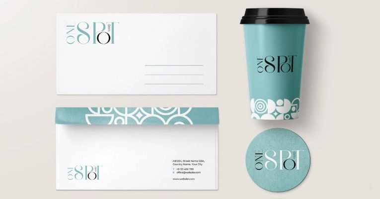
The logo itself is built entirely through custom letterforms, where each character is treated as its own visual system. Instead of relying on a uniform typeface, we introduced variations in weight, curves, and construction, creating a dynamic rhythm across the wordmark. This intentional inconsistency mirrors the nature of a food court — multiple cuisines, personalities, and atmospheres coming together in one place.
Certain letterforms incorporate architectural cues and spatial references, subtly hinting at structures, seating arrangements, and pathways you’d find in a communal dining environment. The interplay of thick and thin strokes adds contrast and movement, while the circular forms soften the composition, making it approachable and inviting.
The vertical “YARD” integration within the typography introduces a layered reading experience, encouraging the viewer to engage with the logo rather than just glance at it. It reinforces the idea of depth and discovery, much like navigating different stalls and experiences within the space.
Overall, the brand captures the essence of The Spot Yard as a curated yet organic destination, a place where variety thrives, and every visit offers something new to explore.